Here’s one of the strangest A/B tests I’ve ever run:
Put a blurred product screenshot behind your sign-up form. 🌫️
That’s it. That’s the marketing idea.
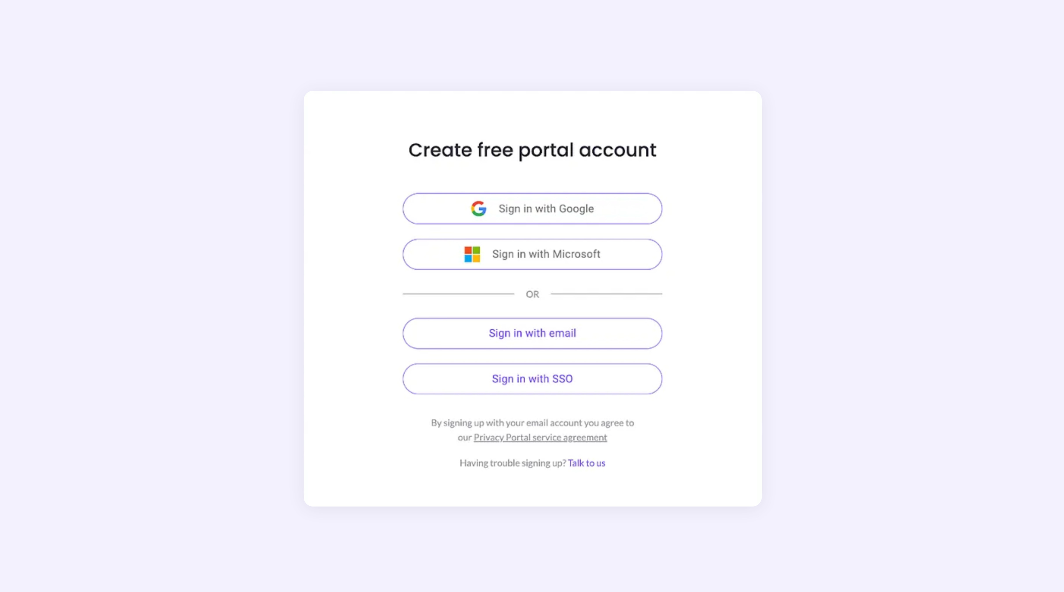
When I was at privacy startup MineOS, our form completion rates jumped by 25% after replacing the default background with this beauty:
Even though the dashboard screenshot was filled with dummy data (no personalization at all), visitors couldn’t tell it was fake—and they couldn’t resist wanting to get past that form to see what awaited them.
📈 It made visitors want to see more → and increased our conversion rates.
It converted 25% better than our old original version:
🧠 Why this psychological trick works so well
The blurred background creates 3 powerful effects:
😲 It triggers curiosity gaps - Our brains hate incomplete information. When we see something partially hidden, we’re wired to want to complete the picture.
⚙️ It creates a progress illusion - Users feel like they’ve already made it inside your product and just need to complete “one final step” to unlock the full experience.
🌈 It builds trust through previewing - Even blurred, the screenshot reassures visitors about what they’re signing up for. This helps with reducing uncertainty that often leads to abandonment.
💡 Real-world validation beyond my test
This isn’t just my experience!
Other companies have seen even more dramatic results.
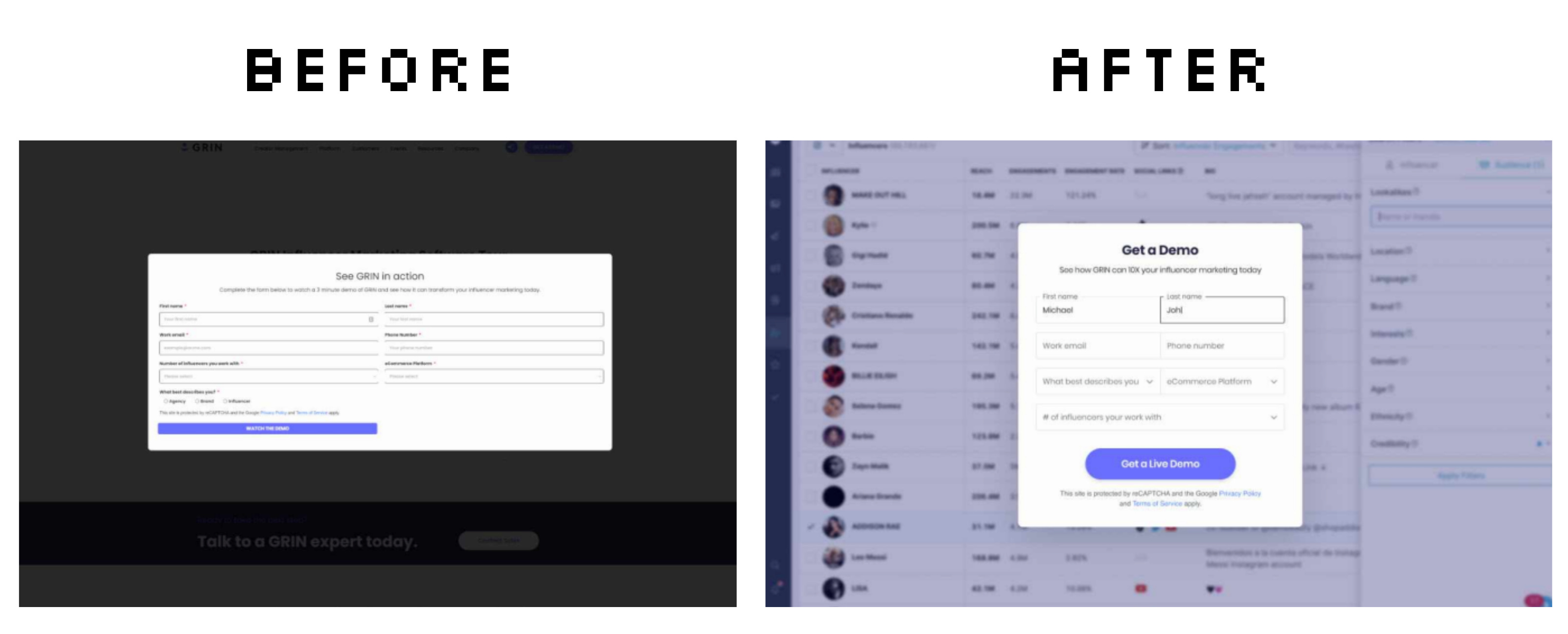
GRIN saw a 39% increase in conversions thanks to the blurred product UI:
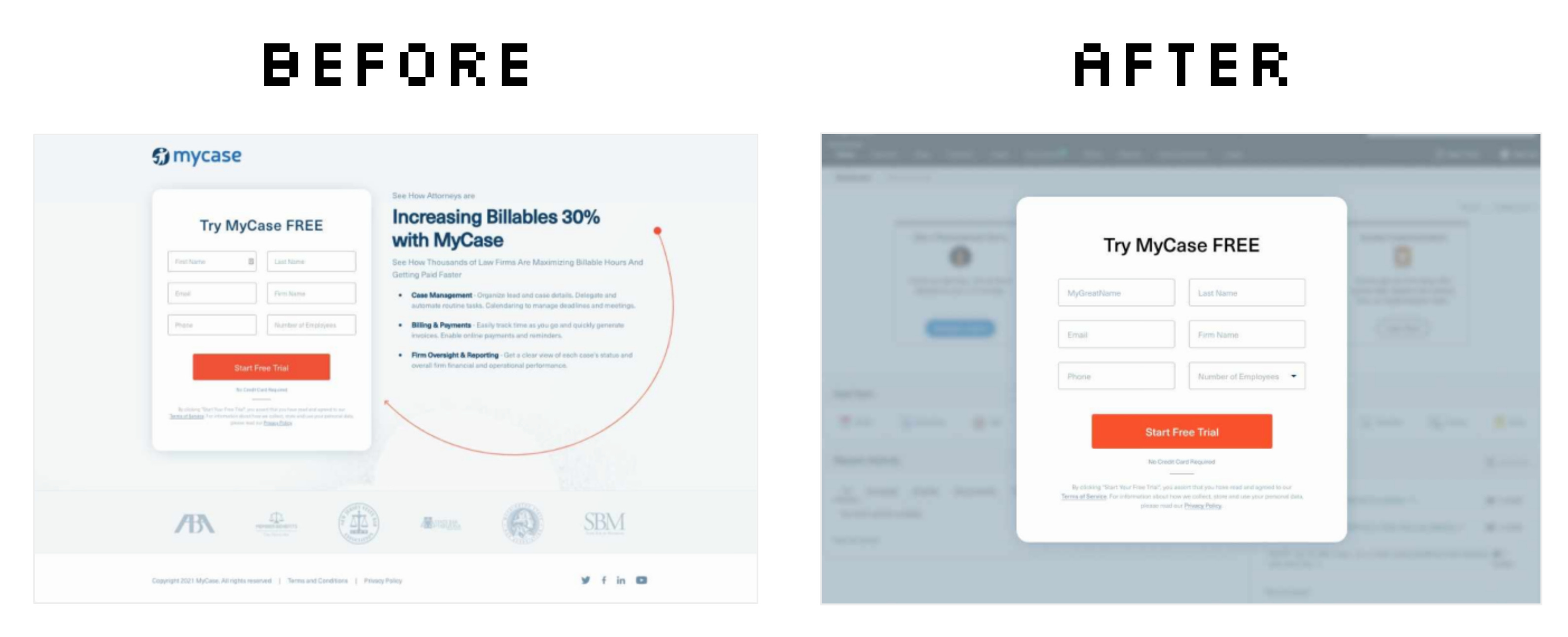
MyCase saw a 94% increase in conversions (!!) thanks to this redesign:
🧩 Easy upgrades to try
If you’re implementing this tactic, consider these advanced versions:
🖍️ Gradual reveal - Increase clarity with each completed field, making the background progressively less blurred as users fill out the form.
🌀 Animated blur - Add subtle movement to the blurred background to create a sense of urgency and life “just on the other side”.
🤏 Teaser pointers - Add small arrows or highlights pointing to blurred features with copy like “See your results here”
What I love about this trick is its simplicity: Five minutes of design work can create a powerful conversion improvement that leverages pure human psychology.
See you next week ✌️
Tom
If you enjoyed this marketing idea, please tap the Like button below ♥️ Thank you!